I'm a neophyte when it comes to designing apps around monetization; and while studying a few AAA apps doesn't make me an expert, it has given me some ideas that I'd like to try with my games and share with other developers to critique.
In Hamster Chase you can earn coins by beating levels, and then spend them later to skip levels. In the next update, players will be able to buy them, too. Here is the in-app screen I designed to appear in the game when a player wants to skip a level but does not have enough coins:
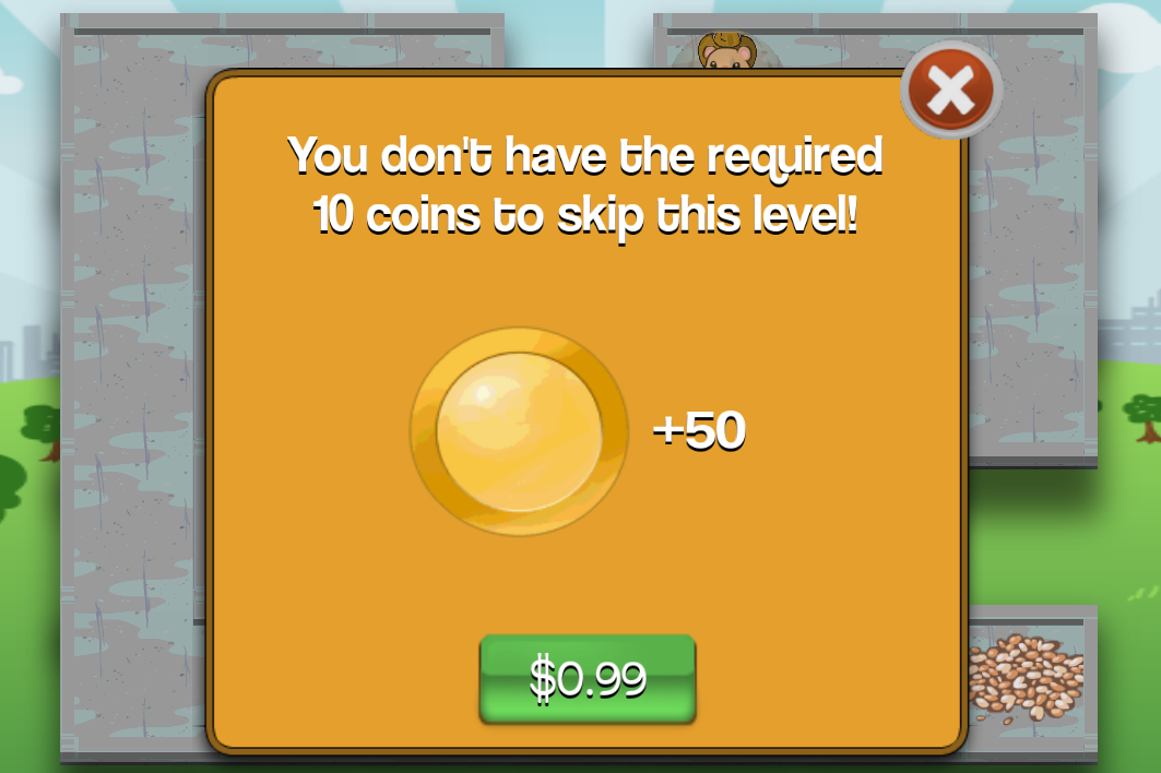
These were the considerations I made in the design:
- It appears immediately in the game when the player wants to use coins that they don't have.
- Nowhere do you see the word "buy." I'm treating "buy" as an evil word, and also a redundant one since the price is already on the purchase button. Think about it: do you say to your friends "lets go get some dinner" or "lets go buy some dinner?" The only time I'll use "buy" is if the app has trouble fetching the price from the store portal.
- I kept the words to a minimum, and relied more on icons and colors. From looking at it, I'm hoping a player can tell that they don't have enough coins, how many coins they need, and how many they will get for how much money.
- The purchase button is larger than the cancel button.
- The purchase button is a green color, and the background hue is close to being red. Reading http://www.webpronews.com/colors-that-sell-2003-01 and http://blog.kissmetrics.com/color-psychology, I infer that red color tones communicate energy, excitement, and urgency. Green is associated with life, money, "green means go" and is easiest on the eyes to process. Yes the cancel button is a deep red, but I consider that a standard color for cancelling anything.
In-app screen design aside, here are some other ideas I'm running with in this next update:
DO
: Have boosters that players can purchase to win the game more easily.DON'T
: Hide the fact that players can purchase boosters if they don't have any.DO
:Let players purchase a booster immediately when they want to use one and they have none.
DON'T
:
Make a player go to an entirely different place in the app to
purchasesomething.
DO
:Consider allowing players to also earn boosters without purchasing them.
DON'T
:
Give away so many free boosters that there's no point in
purchasingthem.
DO
:
Think carefully about every detail in the appearance of an in-app purchase prompt.
DON'T
:
Just throw together an in-app purchase screen with minimal effort.
DO
:Consider having more expensive boosters to let players win the game more easily than cheaper boosters.
DON'T
:
Charge $37.99 for a booster.[color=#d3d3d3] [/color]
[color=#808080]
(Counter-point: I
f someone is willing to pay $37.99 for it, why stop them?)
[/color]DO
:Let the player discover they want or need something before presenting the opportunity to purchase it.
DON'T
:
Harass or pressure players into wanting something with repeated pop-ups or waiting screens.
DO
:Consider selling players non-boosters that just make the game more fun, such as hats or skins.
DON'T
:
Try to sell anything to a player unless you either give them a free sample or explain what the item is for.
DO
:Study the in-app flows of popular games
similarto yours to learn how players find their products, and see how they are encouraged to buy them.
DON'T
:
Prioritize making money over making a genuinely fun game or having fun making one.
[color=#808080]
(Counter-point: I
t's easy for me to say because this isn't my full time job)
[/color]And now, my [color=#daa520]golden [/color]rule of in-apps:


You might be interested in this video of David Edery's presentation at 2012 Casual Connect, "your first f2p game, where you will go wrong".
Looks like a good list of ideas you've come up with, but looking at the screenshot above I see you're only presenting a single price point -- it seems to be pretty common to present multiple price-points, so that a player that is willing to spend more money can do so, usually getting slightly better value for their money. :-)